All posts by Ed Garcia

225 Illustrator tutorials

Illustrator Icon

designertoday.com has a list of 225 different Illustrator tutorials; from beginner to advanced. Because you can never have enough tutorials or bookmarks to save them.

It seems “more” is surely in… every time I have seen a collection of tutorials during the last month the number just keeps growing 10 – 20 – 50 -100 and now 225 tutorials for Illustrator; because I guess 200 tutorials were not enough.

But then again, who am I to complain about free? Enjoy.

Ars Technica – MacBook Air review

Apple MacBook AirHere is an actual review, not just first impressions, of the MacBook Air by Ars Technica. This review deals with only the standard 4200rpm hard drive version – they will do another review for the solid-state hard drive version of this laptop on February 5th.

Big points of the review are:

  • The small size is only based on how thin it is, since in terms of desktop space it only saves a bit compared to the regular MacBook.
  • It’s trackpad is bigger than MacBook and MacBook Pro, but the gestures use is still limited.
  • For audio it has one speaker (good bye stereo) and it is still louder than a MacBook – but then again what isn’t?
  • Lacking a regular CD/DVD drive can be a pain if you don’t plan ahead or don’t always take your installation disks with you
  • The weight is a huge attribute; makes it very comfortable
  • It’s performance “Achilles heel” is the slow hard drive
  • Some users are experiencing louder than normal fans on these, but not the reviewer
  • Don’t even try the remote Migration Assistant, just don’t
  • WiFi is ok, but not close to the MacBook sensitivity
  • Actual usage time on the battery was about 2 hours and 33 minutes. Ouch, that is not even half of the 6 hours advertised!

Read the full review to make your opinions… but seems quite a disappointment for some of us. I could have lived without the DVD drive. I could have lived with the slower performance (on the go only!!). But such a short battery life is really a disappointment; especially for a computer that is made to take with you everywhere you can take a manila folder.

last.fm frees the music

Last.fm logoFor those of us that can actually listen to music while we work, I highly recommend last.fm

This is more so now that since last week you can listen to full albums right from your browser. It has a bit of a long process to install, but it is simple. Just create the free account, download their software, integrate it with the music player of your choice and it will look for your favorite songs, genres and artists. All this happens in the installation program so it is not as complicated as it might sound.

After installation, the system on their website will automatically start creating a play list of songs that you should like based on your favorites from the media player you chose during installation. It might take a few hours to find the perfect songs for you but wait until the site is done and come back later.

Ok, you came back and now your last.fm account has your profile and play lists ready. Just hit the play button and start listening to their recommendations. Don’t like a song? Just use the skip button, or the BAN button, and the system will learn your music taste based on your decisions. Love the current song? Click the LOVE button and your play list will continue to be filtered by those choices. The more you train the system by letting it know which songs you like and which you don’t the better selections it will give you.

 And now you can select an artist and scroll down to the albums, now you can just select and play the full album. Not all of the albums for each artist are available but the collection is quite good. Enjoy!

designers are a picky bunch

Mouse Pointer

The title should come as no surprise; but thanks to that fact we can drive developers and programmers crazy sometimes.

We are picky on what goes where (layout), picky on which color to use (color combination), picky on how images should display (image manipulation), and if you are head of the project – specially picky on how the system works (design usability) and finally picky on the details that make the project look complete. These are pieces of the puzzle that some programmers and developers only pay light attention to. Just look at design-police.org for guidelines; yeah we have that many.

Although a system can -work- correctly, it might not display correctly or it might not give the impression a finished system should give. On the other side of the coin, programmers do pay attention to other parts of the system that we might not pay as much attention to. A programmer, somewhere, is mentioning this concept in a programming blog.

Continue reading

Best of CES according to Gizmodo.com

Gizmodo CESEvery year the electronics community gathers to see what is the future of those lovable gadgets and plasma screens every technophile salivates for. This show is called the CES; the Consumer Electronics Show and this year it was celebrated January 7 to 10, 2008 in Las Vegas.

The lucky guys at Gizmodo where there and have created a list of what they think were the best offerings at the show. Everything from 150″ TVs (yep, that is right 150 inches of pure imagery), media players, geek appearances and weird gadgets you weren’t expecting. Like for example a leopard skin taser with built-in MP3 player – what? Don’t believe me? Just follow the link.

And that is why we love CES; a bunch of gadgets that we won’t get anytime soon, if at all, and a lot that are just fun reading about – because you don’t really want them.

Excellent collection of Photoshop tutorials

Photoshop icon

Smashing magazine has an great collection of Photoshop tutorials. Anything from rendering products, lightning effects, retouching photos and improving their look, reflections, creating product boxes… you name it and it is probably there.

The list of tutorials is over 30 pages long, and that is not counting how long each tutorial is. So if you have a lot of free time to master your Photoshop skills this is a very good place to start; also a great page to bookmark since you won’t be done with those tutorials in a while and you might need them later.

10 usability and interaction design books

If you are into usability and interface design these are a must; a great book collection by Smashing Magazine. If you are a web designer or developer some will actually help you not make common mistakes, others will take your techniques farther, but understanding them will surely improve the usability of your projects.

Here is their list:

  1. About Face 3. The Essentials of Interaction Design by Alan Cooper, Robert Reimann and David Cronin

  2. Prioritizing Web Usability by Jakob Nielsen, Hoa Loranger

  3. Designing the Obvious. A Common Sense Approach to Web Application Design by Robert Hoekman, Jr.

  4. Don’t Make Me Think. A Common Sense Approach to Web Usability by Steve Krug

  5. The Design of Sites. Patterns for Creating Winning Web Sites by Douglas Van Duyne, James Landay, Jason Hong.

  6. The Design of Everyday Things by Donald A. Norman

  7. Designing Interfaces: Patterns for Effective Interaction Design by Jenifer Tidwell

  8. Designing for Interaction: Creating Smart Applications and Clever Devices by Dan Saffer

  9. Designing Interactions by Bill Moggridge

  10. Envisioning Information by Edward R. Tufte

This is only a partial list; for the complete list (they include editor choices) and for more information on each book read the Smashing Magazine article.

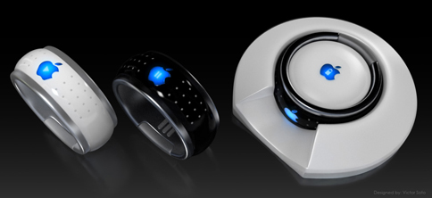
iRing design by Victor Soto

iRing design by Victor Soto

Apple lovers, keep in mind this is just a concept and not coming to stores any time soon so don’t go asking for it at the Apple store just yet.

The iRing, a concept design by Victor Soto, is meant to connect to the iPhone or iTouch via bluetooth. (although the iTouch doesn’t have bluetooth right now) It would control functions like volume, move back and forward through you songs or media, and mute. All this through touch sensitive controls on the surface of the ring; it also employees a lock mechanism so you don’t go changing the volume because you moved your hand.

A bit ahead of it’s time in terms of actual implementation, but I believe it is a nice idea on what the future can hold for device control. It was made with the Apple products in mind, but imagine music systems and TVs that can be controlled this way.

Imagine never running around the house trying to find the TV remote, it is always in your hand. I surely want to imagine that.

Gizmodo unboxes the new Apple MacBook Air

Apple MacBook AirFor those of you that don’t know, Apple released their MacBook Air January 15th 2008 and it should start shipping the first week of February. The lucky guys at Gizmodo have received one already. How does it compare to other ultra-portables in the market? How does it compare to the Sony VAIO?

Gizmodo has an article about it. Looks like a great machine for those that don’t care to lose a bit of performance for commodity and design, it sure looks nice. Check it out.